CSVデータからグラフを描く
10分ごとに計測している、気温、湿度、気圧、二酸化炭素濃度のデータを記録しているCSVファイルからデータを読み出し、グラフ化してみました。pandasとmatplotlibを使用しています。とりあえず、ターミナルで以下のコマンドを実行します。
$ sudo apt-get update
$ sudo apt-get install python3-pip
$ sudo apt-get install python3-pandas
$ sudo apt-get install python3-matplotlib
時刻、温度、湿度、気圧、二酸化炭素濃度が保存されたcsvファイルの中身は以下のようになっています。
2021/09/10 00:00:02,27.04688360267901,54.77714997562036,1003.2419347349937,442
2021/09/10 00:10:02,27.0008524954319,54.74077742629164,1003.2204064423108,442
2021/09/10 00:20:02,26.88833211029414,54.87153361583788,1003.144273195621,436
2021/09/10 00:30:02,26.816728302184494,54.91018195987762,1003.1870707203142,440
2021/09/10 00:40:01,26.7348954484798,55.00679193864796,1003.2661316644903,436
2021/09/10 00:50:02,26.673520857095717,55.138957184084624,1003.272573226132,447
2021/09/10 01:00:02,26.653062669280917,55.20242730385607,1003.318734161733,458
2021/09/10 01:10:02,26.54054271953646,55.47274136986343,1003.4008974946622,441
2021/09/10 01:20:02,26.49451187160448,55.40138363376406,1003.3792779160628,447
2021/09/10 01:30:02,26.40245024646283,55.433420608494735,1003.4680227705393,443
2021/09/10 01:40:02,26.284816084895283,55.668395982776055,1003.4097606823948,437
2021/09/10 01:50:02,26.192754674539902,55.9331640162646,1003.419217193011,433
2021/09/10 02:00:02,26.126265936816345,56.02408509409851,1003.4436158547053,436
2021/09/10 02:10:02,26.075120787421476,56.10384911287156,1003.4928143333177,437
2021/09/10 02:20:02,26.075120787421476,56.42384198420905,1003.4664276125951,450
2021/09/10 02:30:01,25.99328860892565,56.357072582163745,1003.4395762657244,430
2021/09/10 02:40:02,25.94214353520074,56.39023474865098,1003.4359741605601,432
このcsvをpythonで読み込んでグラフ化します。pythonでcsvを読み込むにためにpandasを使います。グラフ化するのは、matplotlibというライブラリを使います。
# -*- coding: utf-8 -*-
import pandas as pd
import matplotlib.pyplot as plt
import matplotlib.dates as mdates
import datetime

#今日の日付のファイルからデータをpandasで読み込む
dir_path = '/home/pi/bme280-data/'
today=datetime.datetime.now()
filename = today.strftime('%Y%m%d') + 'New'
data = pd.read_csv(dir_path + filename + '.csv',
                   names=('Time','Temperature', 'Humidity', 'Pressure', 'CO2'),
                   index_col='Time',
                   parse_dates=True)

#気温、湿度、気圧、二酸化炭素濃度のデータを分ける
df_tmp = data.iloc[:, [0]]
df_humid = data.iloc[:, [1]]
df_press = data.iloc[:, [2]]
df_co2 = data.iloc[:, [3]]

# Figureの初期化
fig = plt.figure(figsize=(12, 18))

# Figure内にAxesを4つ追加
ax1 = fig.add_subplot(411) #気温用
ax1.plot(df_tmp,color = "r")#"b"(青), "g"(緑), "r"(赤), "c"(シアン), "m"(マゼンダ), "y"(イエロー), "k"(黒), "w"(白)で指定する
ax1.set_xlabel('Time') #横軸のラベル
ax1.set_ylabel('Temperature') #縦軸のラベル
ax1.legend(['Temperature degree Celsius'])#凡例
#ax1.set_xticks([]) #目盛りを表示しない
ax1.xaxis.set_major_locator(mdates.HourLocator(byhour=range(0, 24, 2)))#2時間ごとに目盛りを表示
ax1.xaxis.set_major_formatter(mdates.DateFormatter("%H:%M"))#横軸の目盛りのフォーマット
#ax1.set_title('気温の変化')  # グラフタイトル

ax2 = fig.add_subplot(412)
ax2.plot(df_humid,color = "b",)
ax2.set_xlabel('Time')  # x軸ラベル
ax2.set_ylabel('Humidity')  # y軸ラベル
ax2.legend(['Humidity %'])  # 凡例を表示
#ax2.set_xticks([])
ax2.xaxis.set_major_locator(mdates.HourLocator(byhour=range(0, 24, 2)))
ax2.xaxis.set_major_formatter(mdates.DateFormatter("%H:%M"))

ax3 = fig.add_subplot(413)
ax3.plot(df_press,color = "g")
ax3.set_xlabel('Time')  # x軸ラベル
ax3.set_ylabel('Pressure')  # y軸ラベル
ax3.legend(['Pressure hPa'])  # 凡例を表示
#ax3.set_xticks([])
ax3.xaxis.set_major_locator(mdates.HourLocator(byhour=range(0, 24, 2)))
ax3.xaxis.set_major_formatter(mdates.DateFormatter("%H:%M"))

ax4 = fig.add_subplot(414)
ax4.plot(df_co2,color = "y")
ax4.set_xlabel('Time')  # x軸ラベル
ax4.set_ylabel('CO2')  # y軸ラベル
ax4.legend(['CO2 ppm'])  # 凡例を表示
#ax4.set_xticks([])
ax4.xaxis.set_major_locator(mdates.HourLocator(byhour=range(0, 24, 2)))
ax4.xaxis.set_major_formatter(mdates.DateFormatter("%H:%M"))

plt.savefig("/home/pi/bme280-data/graph.png")
plt.show()
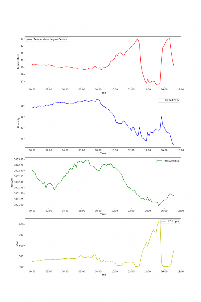
表示されたグラフは、以下の通りです。